Frutiger Aero: The Promised Future

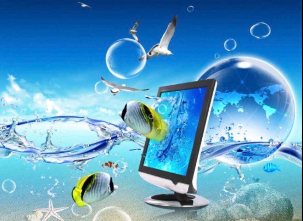
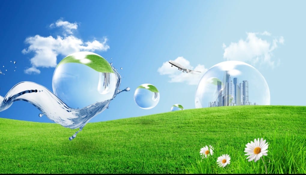
Glass fruit, water reflections, skeuomorphism, vibrant colors: it’s all part of the clean, glossy aesthetic that is Frutiger Aero, the aesthetic that ended the Y2K Futurism that had been around the last decade. It was a very popular style back from around 2004 to 2013. This surge in popularity led to its use in everything at the time, especiallywith companies and their advertisements. For example, Windows used Frutiger Aero styling with Windows Vista through Windows 7, Apple used it in iOS 1 to 6, and Nintendo with the Wii.
The main idea of Frutiger Aero was that nature and technology could coexist and thrive together. This was especially popular at the time because it represented the idea of a clean, humanistic future with technology. The representation of a “green future” provided optimism for the future of technology and nature and rapid development with how sleek and advanced everything was made to look. The term itself derives from the Frutiger interface designed by Adrian Frutiger. The “Aero” part stands for Authentic, Energetic, Reflective, and Open. So the name consists of a shared common idea.
However, as popular as Frutiger Aero was, it quickly died out in the mid 2010s; companies took on a flatter design that we saw with the following Windows softwares of 8 and 9 that took on a bleaker and more “efficient” design according to large corporations. After that, well, Frutiger Aero’s influence diminished to near zero. In fact, there wasn’t even a term for Frutiger Aero until 2017 where it was coined by Sofi Lee of the Consumer Aesthetics Research Institute. This is where Frutiger Aero stood until around 2022.
In mid-2022, however, due to the increasing negative news around the controversial topics of AI and climate change, platforms like TikTok and YouTube were used as mediums to express backlash to the flat, boring, and “minimalistic” style corporations had taken in the mid 2010s. As a secondary effect, Frutiger Aero and the hope for the “green future” the public was promised was resurrected. Its increase in popularity was furthered by users on the two platforms either discussing Frutiger Aero places, or idealizing the style of a supposed Frutiger Aero future.
This is where Frutiger Aero stands today. While it is nowhere near the popularity it had in the past, it stands as a more niche but interesting aesthetic that many people appreciate and romanticize. Will we ever get a future like this with glass buildings and electronics? Will we have futuristic buildings that mirror this aesthetic like eco-futuristic, green, or sustainable architecture? While it’s possible, most likely we will never see that. But it’s still fun to think about, for we have the new iOS 26 and the iPhone Air which both have seemingly reverted to a Frutiger Aero styling.
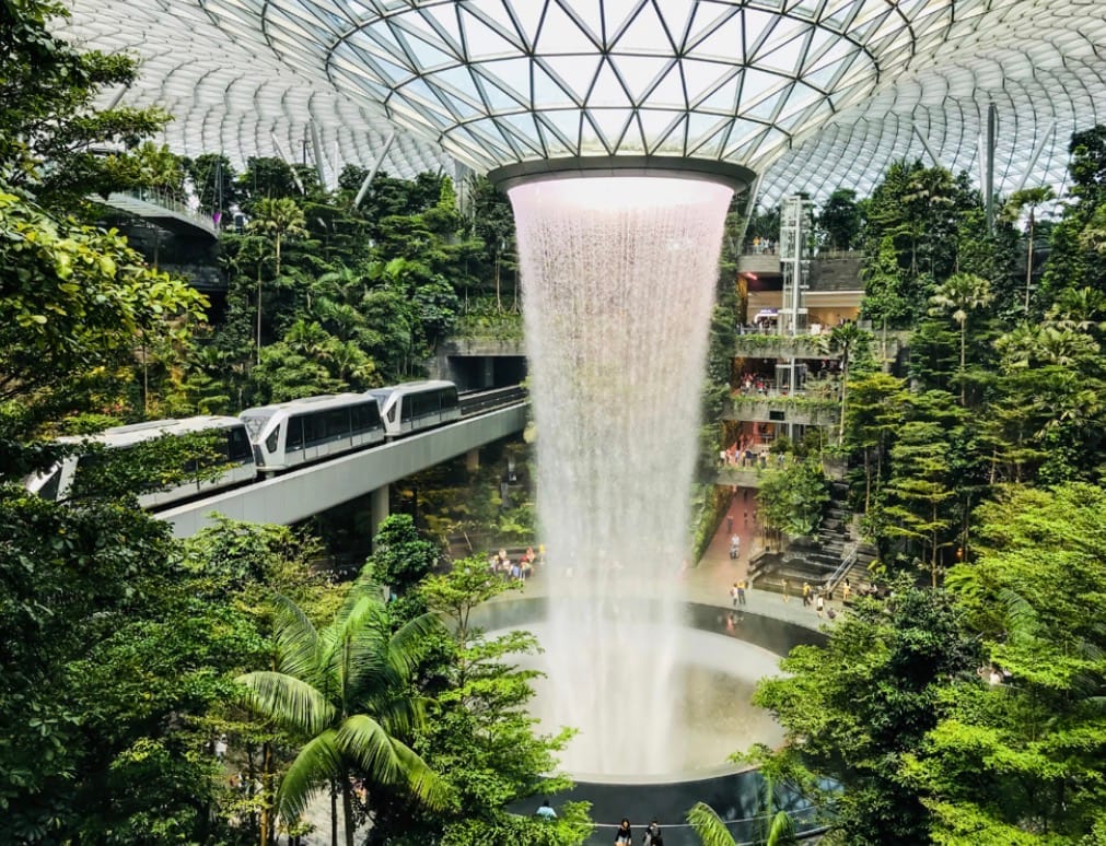
So, unfortunately for the people who value and romanticize the idea of a Frutiger Aero like society will probably never see it. It’s a fun idea and was fun while it was in its prime. But, there are still many places that have Frutiger Aero designs, to name a few for example, a dentistry in Ukraine (Клініка Цифрової Стоматології or the Clinic of Digital Dentistry) incorporates the style in its construction, the Park Inn in Amsterdam, the I-Suite in Italy, the Jewel Changi airport in Singapore and many more. Or if you look into any older media, in specific, things like the Wii, like I said earlier, the WiiU, the Xbox 360, and older iPhones and IPods all take up this style.